Announcement

Collapse
No announcement yet.

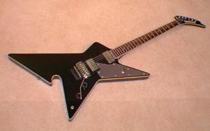
Gibson Shark Fin

Collapse
X
 
  • Filter
  • Time
  • Show
Clear All
new posts

  • #16
    BTW those pants that Ed's wearing.... :ROTF:
    GTWGITS! - RacerX

    Comment


    • #17
      The very least they could have done was went with a neck-through instead of a set neck. Like most of you I'm not impressed with the looks. I saw, I think it was called a Holy V by Gibson basicly a Flying V which looked like it had a jigsaw taken to it by a bored methhead. First look I thought it was something fake by how tacky it looked to me but went to there website and sure enough. Gibson has'nt been to overly fresh in the design department for awhile, maybe thats why they sue everyone that makes a guitar that looks remotely like theres? By the way I bet those pants Ed's wearing are Bell bottoms.lol
      Last edited by tomanyjacksons; 10-02-2009, 03:14 AM.
      I want to go out nice and peaceful in my sleep like my grandfather, not screaming and hollering like the passengers in his car.

      Comment


      • #18
        I actually think EVH's is even uglier than the Gibson one. Both are ugly.
        http://www.amazon.co.uk/Steven-A.-McKay/e/B00DS0TRH6/

        http://http://stevenamckay.wordpress.com/

        Comment


        • #19
          I would like the Gibby better if the headstock weren't reversed.
          Death Or Glory - Who Dares Wins

          Comment


          • #20
            Looks like a newbie made an error in Gibson's wood shop.

            The reverse headstock is cool but the unbound board and plain ol' dots on the fingerboard make the guitar look like an exercise is using up leftover/botched parts as cheaply as possible.
            Takeoffs are optional but landings are mandatory.

            Comment


            • #21
              Originally posted by fuel0707 View Post
              an exercise is using up leftover/botched parts as cheaply as possible.
              No, no, no. That's the "faded" series. And the LP Standard. And the SG Standard. And... Well everything that isn't a Custom Shop or a Signature.

              Comment


              • #22
                we all know who makes the ONLY cool pointy guitars around here, RIGHT?????

                Comment


                • #23
                  Originally posted by DonP View Post
                  It seems like Gibson is the only company trying to come up with something different. Sure it may be fail most of the time, but at least they are trying.

                  Look at the flying V, explorer and modern. All three were fail when they came out in the 50s, but now 2 of the 3 are huge hits. Whose to say that some of these "experiments" might not become huge hits in the future? You just need a "Slash" or Randy to pick one up and make a record with it.
                  The Moderne is the holy grail of Gibson though.

                  Comment


                  • #24
                    Originally posted by axeman81 View Post
                    we all know who makes the ONLY cool pointy guitars around here, RIGHT?????
                    The Explorer is a pretty cool guitar. I let mine go mostly because I just hate Gibson fretboards.

                    If only Jackson would make a neck-through Explorer. I don't like the Kelly; I've tried but that weird curvy lower point just... blech.

                    Comment


                    • #25
                      Originally posted by MakeAJazzNoiseHere View Post
                      The Explorer is a pretty cool guitar. I let mine go mostly because I just hate Gibson fretboards.

                      If only Jackson would make a neck-through Explorer. I don't like the Kelly; I've tried but that weird curvy lower point just... blech.
                      I love the explorer, I just hate the necks themselves.

                      Comment


                      • #26
                        Kinda looks like a Killer or one of those Scarabs Glenn Tipton was playing. I think it would look nice in black but that silver grey looks cheap.
                        THIS SPACE FOR RENT

                        Comment


                        • #27
                          I actually like it. I just think the longer wing should have a sharp corner like the shorter one. But It's pretty cool actually

                          Comment


                          • #28
                            Originally posted by zuppermuhle View Post
                            I actually like it. I just think the longer wing should have a sharp corner like the shorter one. But It's pretty cool actually

                            I like it too. It does look a lot like a Killer (Akira's)
                            shawnlutz.com

                            Comment


                            • #29
                              fugly
                              Fuck ebay, fuck paypal

                              "Finger on the trigger, back against the wall. Counting rounds and voices, not enough to kill them all" (Ihsahn).

                              Comment


                              • #30
                                Originally posted by stevieb91 View Post
                                Looks alot like the Culprit.
                                Ummm, no, it doesn't.

                                I feel my soul go cold... only the dead are smiling.

                                Comment

                                Working...
                                X