Announcement

Collapse
No announcement yet.

How to Make Your YJM Strat Look Correct!!!!

Collapse
X
 
  • Filter
  • Time
  • Show
Clear All
new posts

  • #16
    Re: How to Make Your YJM Strat Look Correct!!!!

    To make the YJM Strat look even more correct you will need this and some medieval trousers.


    ps. Don't forget the leather boots.
    Comment


    • #17
      Re: How to Make Your YJM Strat Look Correct!!!!

      Then he'd look like Blackmore!
      "POOP"

      Comment


      • #18
        Re: How to Make Your YJM Strat Look Correct!!!!

        Who do you think inspired YJM? [img]/images/graemlins/laugh.gif[/img]

        Comment


        • #19
          Re: How to Make Your YJM Strat Look Correct!!!!

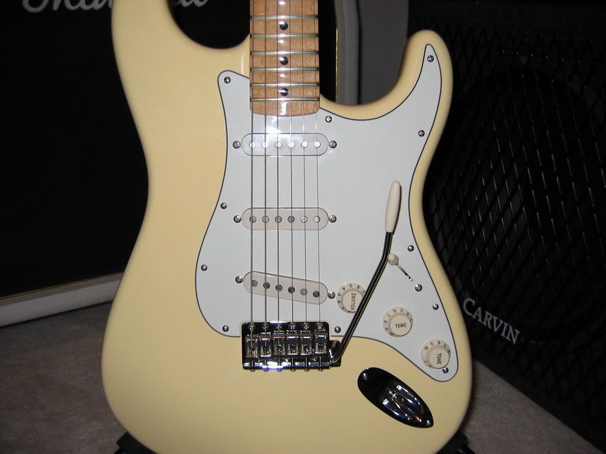
          Ok, Mr. Fender, Ehh Emm, I mean Jim. Here is the YGM with a parchment guard. Does it look more period??? I think it looks better than the mint. Great suggestion! [img]/images/graemlins/notworthy.gif[/img]
          Tone is like Art: Your opinion is valid. Listen, learn, have fun, draw your own conclusions.

          Comment


          • #20
            Re: How to Make Your YJM Strat Look Correct!!!!

            Yes, that last pic. is the best. The mint green guard looks ridiculous on the big headstock Strats. Fine on the '62 reissues but way out of place on the later ones. I don't know what possessed Fender to go with green on the Malmsteen.

            I'm surprised they haven't come out with a Malmsteen super-relic that is beat to hell.

            Comment

            Working...
            X