And he probably hates me now 
6 months or so ago, I had the idea of doing my own version of the Hanneman / Heineken guitar, but I struggled to find a beer that worked with my name. In the end I resorted to an internet search and that prompted me to remember San Miguel, which is at least vaguely close to Ian Neill, in terms of number of characters and spacing. I used photoshop to put together a bunch of label mockups, then played around with the alignment on a pic of a Soloist, which was kinda tough because the bridge creates so much dead space. Then it was just a case of finding the right guitar. A few weeks later, I managed to score J2880 from craigslist for 800 bucks shipped. It already had EMGs, and the kahler was what i was looking for for the Hanneman vibe. So that got sent to direct to Mike.
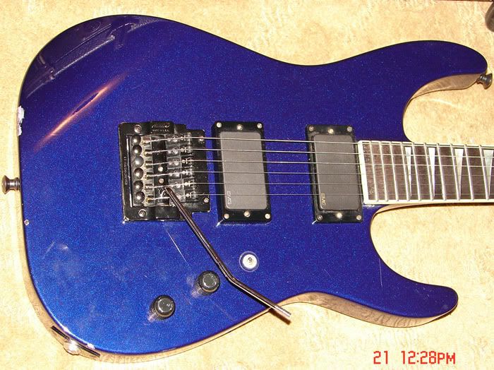
I felt kind of bad because this guitar had a matching head and was in a relatively unusual colour, but it had a bunch of dings, plus the logo had a big lump taken out of it. So that appeased my concience a little! When it arrived, Mike checked the guitar over and confirmed it was solid and worth the expense of a graphic. I also got him to install a Floyd nut rather than the original nut / stringlock which I'm not a fan of.
Mike had some ideas of his own for the label and the design evolved in a back and forth between us. I wanted the text to reflect me, plus the shield is my family crest. Mike came up with the "hear no evil, speak no evil" design to fill in the gap at the bottom, plus he suggested we went for the bottle green background and water droplet look. We went back and forth on the positioning a bit, because the bridge takes up a bunch of space, and then the pickups can make things look disjointed. But we found something that works, and the overall effect is awesome in person:

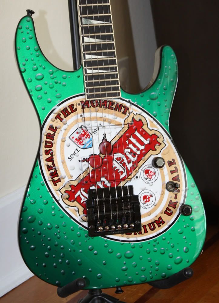
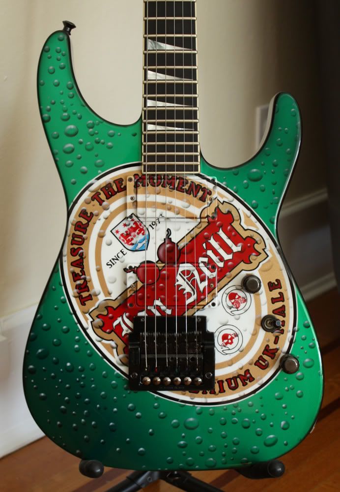
Mike really worked his butt off on this one - he told me the sheer amount of masking was massive, because the design is relatively complex, plus there are painted pickups and pickup rings and the graphic has to run down the side of those. So huge thanks go to Mike for that. I think he was very glad to see the back of this one...
It arrived on Friday but I'd told Mike that I'd set it up and do the wiring so yesterday I polished the frets and oiled the board (as you can see in the top pic, it was pretty damn dry and almost looked like rosewood) and then started the wiring. It was a real mess in there, and today I found out that the spare Jackson toggle I have is fucked, so I have to go find a replacement, preferably one that'll take the San Dimas style knob. Grrr

6 months or so ago, I had the idea of doing my own version of the Hanneman / Heineken guitar, but I struggled to find a beer that worked with my name. In the end I resorted to an internet search and that prompted me to remember San Miguel, which is at least vaguely close to Ian Neill, in terms of number of characters and spacing. I used photoshop to put together a bunch of label mockups, then played around with the alignment on a pic of a Soloist, which was kinda tough because the bridge creates so much dead space. Then it was just a case of finding the right guitar. A few weeks later, I managed to score J2880 from craigslist for 800 bucks shipped. It already had EMGs, and the kahler was what i was looking for for the Hanneman vibe. So that got sent to direct to Mike.

I felt kind of bad because this guitar had a matching head and was in a relatively unusual colour, but it had a bunch of dings, plus the logo had a big lump taken out of it. So that appeased my concience a little! When it arrived, Mike checked the guitar over and confirmed it was solid and worth the expense of a graphic. I also got him to install a Floyd nut rather than the original nut / stringlock which I'm not a fan of.
Mike had some ideas of his own for the label and the design evolved in a back and forth between us. I wanted the text to reflect me, plus the shield is my family crest. Mike came up with the "hear no evil, speak no evil" design to fill in the gap at the bottom, plus he suggested we went for the bottle green background and water droplet look. We went back and forth on the positioning a bit, because the bridge takes up a bunch of space, and then the pickups can make things look disjointed. But we found something that works, and the overall effect is awesome in person:


Mike really worked his butt off on this one - he told me the sheer amount of masking was massive, because the design is relatively complex, plus there are painted pickups and pickup rings and the graphic has to run down the side of those. So huge thanks go to Mike for that. I think he was very glad to see the back of this one...
It arrived on Friday but I'd told Mike that I'd set it up and do the wiring so yesterday I polished the frets and oiled the board (as you can see in the top pic, it was pretty damn dry and almost looked like rosewood) and then started the wiring. It was a real mess in there, and today I found out that the spare Jackson toggle I have is fucked, so I have to go find a replacement, preferably one that'll take the San Dimas style knob. Grrr

Comment