Announcement

Collapse
No announcement yet.

Jacksons Pop Art graphic

Collapse
X
 
  • Filter
  • Time
  • Show
Clear All
new posts

  • Jacksons Pop Art graphic

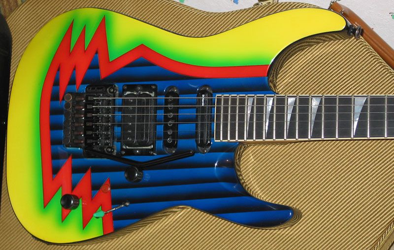
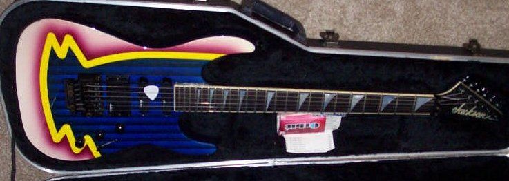
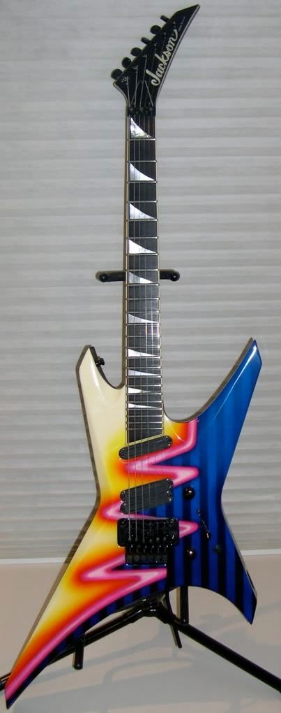
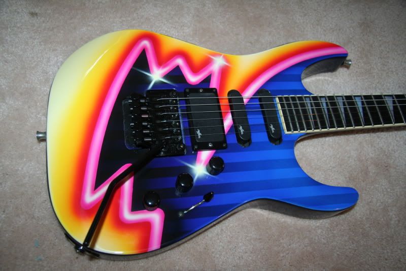
    Jackson Pop Art graphic. Post your pics. Here is what I found
    [IMG][/IMG]
    [IMG][/IMG]
    [IMG][/IMG]
    [IMG][/IMG]

  • #2
    I recently tried to identify that graphic, but I couldn't find any info. Pop Art, eh?
    96xxxxx, 97xxxxx and 98xxxxx serials oftentimes don't indicate '96, '97 and '98.

    Comment


    • #3
      I think I've also heard that called Neon.
      METAL, LIVE IT!

      Comment


      • #4
        I found a pic online calling it Neon Pop Art.
        96xxxxx, 97xxxxx and 98xxxxx serials oftentimes don't indicate '96, '97 and '98.

        Comment


        • #5
          ACK! Those are hideous. Though, graphics like that and the Nagel make me chuckle at the thought of black or death metal dudes praising satan whilst rocking a neon scribbled warrior!!!!!
          GEAR:

          some guitars...WITH STRINGS!!!! most of them have those sticks like on guitar hero....AWESOME!!!!

          some amps...they have some glowing bottle like things in them...i think my amps do that modelling thing....COOL, huh?!?!?!

          and finally....

          i have those little plastic "chips" used to hit the strings...WHOA!!!!

          Comment

          • #6
            That first one is a beauty

            Comment


            • #7
              I like all of those, beats boring basic black that's for sure.
              In the future though I need to remember to not buy guitars while on Nyquil

              Comment


              • #8
                Not to be confused with the more desirable pop-tart graphic.
                GTWGITS! - RacerX

                Comment


                • #9
                  mmmmm..... pop tarts.....

                  Comment


                  • #10
                    Love it on the warrior for some reason.

                    Comment


                    • #11
                      Not so keen on the 3rd one but the others are awesome. Cheesy or not, gimme 80s graphics any day.

                      Comment


                      • #12
                        I'm a big fan of graphic finishes, but those wouldn't be my first choice. It does look cool on the warrior, as it cuts right in the center.

                        Comment


                        • #13
                          I call it fugly. But otherwise very nice.

                          Comment


                          • #14
                            Really digging that first one. Other than a guy trying to sell it on a forum a few years ago I can't find anything on these.

                            Comment

                            Working...
                            X