Announcement

Collapse
No announcement yet.

Ok, I guess this is the only way... Photoshop Request!

Collapse
X
 
  • Filter
  • Time
  • Show
Clear All
new posts

  • Ok, I guess this is the only way... Photoshop Request!

    Ok guys, being "this" close to laying down the money, actually, I think I'll go with Matt's music now, he got my quote correct and seems much more helpful than Jason at DCGL, here's what I need to clear off my mind.

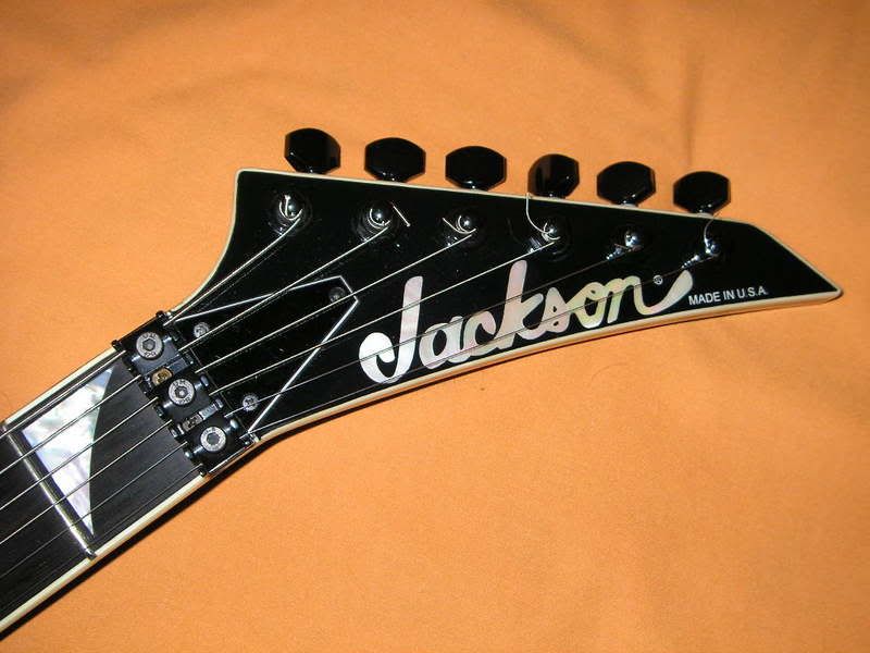
    Can someone please, taking this original picture as a starting point:

    Add a regular snakeskin texture taken from the snakeskin that Jackson uses (gray) which can be found on my other Snakeskin pic request, to the black headstock, so I can see how the pearl logo contrasts with it? Maybe darken the logo a bit since the original pearl color is a bit more grayish and the pic had a white light shining over it so it won't be that true with the current logo on this pic.

    Please, I have no idea how to use Photoshop or any of that stuff so I need your help guys, urgently.

    Oops, here's the pic!


  • #2
    "Quiet, numbskulls, I'm broadcasting!" -Moe Howard, "Micro-Phonies" (1945)

    Comment


    • #3
      I know man, I know...

      Comment


      • #4
        not darkening the logo...cant grab the jackson snakeskin itself so i used a real snake skin...but it should give you an idea...d.m.

        http://www.mp3unsigned.com/Devane.ASP

        http://www.mp3unsigned.com/Torquestra.ASP

        Comment


        • #5
          Wow thanx diablo!

          Yeah, it doesn't look that good, it makes the whole headstock look kinda white and that will get worse if I get one of the bleached light gray's.

          I've been thinking maybe brown python? It does look a bit more real than gray.

          Actually, you know what? I could ask the guys at Jackson something very simple: I want my whole guitar snakeskin finished BUT with a pearl logo AND I want to see the logo in good contrast with the snakeskin, so, I would like a darker more olive-gray-brown python kind of color so that the pearl logo will have a good contrast, without adding any black outlines or anything like that.

          Another option is to have the headstock just black, that will solve the problem alright but it will look like any other Snakeskin KV2 with EMG's... so that's kind of like the dilemma.

          Pro's of snakeskin finished headstock: Makes the guitar look cooler, more complete, you can actually tell it's different from others, etc etc.

          Cons: I have to choose a correct tone of snakeskin so that the logo will look good.

          Pro's of a black headstock: It makes the logo look great, perfect contrast, and makes the fretboard and headstock look like a whole piece.

          Con's: well, it's just standard...

          Comment


          • #6
            Oh Diablo, could you please tone down that finish so it looks more brownish, dark grayish/oliveish?

            Comment


            • #7
              difficult...but i tried...doesnt help much...i would actually recommend a black logo over snakeskin i think...or black with a white shadow underneath it...d.m.

              http://www.mp3unsigned.com/Devane.ASP

              http://www.mp3unsigned.com/Torquestra.ASP

              Comment


              • #8
                or like this one...d.m.


                http://www.mp3unsigned.com/Devane.ASP

                http://www.mp3unsigned.com/Torquestra.ASP

                Comment


                • #9
                  The black logo looks great over snakeskin.

                  Comment


                  • #10
                    Ok, let's clear this... I don't want any other logo that is not the PEARL logo.

                    So, the solution will be find a tone of snakeskin that will help the logo stand out, without any black outlines, shadows, etc. Just the pearl.

                    So my guess will be maybe the brown python or the copper head, I like both. But, I NEED to see this before I order, I mean, Jackson should have a color palette for us to see, like, different options, tones, etc. It's very difficult, I mean, the only way for me to tell if I like the logo with the snakeskin will be seeing it on my custom made guitar, what if I don't like it? There goes 4 grand!

                    So, my ONLY help is PHOTOSHOP I really need to see this guys, please help me, im very close to sending the first payment.

                    Comment


                    • #11
                      they do...but it is flash based and hard to grab their image...d.m.
                      http://www.mp3unsigned.com/Devane.ASP

                      http://www.mp3unsigned.com/Torquestra.ASP

                      Comment


                      • #12
                        grabbed a lo res image from another site..only an approximation but the coloting is correct for copperhead...d.m.

                        http://www.mp3unsigned.com/Devane.ASP

                        http://www.mp3unsigned.com/Torquestra.ASP

                        Comment


                        • #13
                          ...and a blueish grey snakeskin lifted off an ebay auction for a sl2h...i think im done for the night...lol...d.m.

                          http://www.mp3unsigned.com/Devane.ASP

                          http://www.mp3unsigned.com/Torquestra.ASP

                          Comment


                          • #14
                            You can ask them to leave a black border around the letters. That would solve your problem, since it is an overlay anyway. And I am sure we have seen that before, no?
                            Scott
                            Be without fear in the face of your enemies. Be brave and upright, that God may love thee. Speak the truth always, even if it leads to your death. Safeguard the helpless and do no wrong.

                            Comment


                            • #15
                              Hey diabloMozart, you RULE MAN!

                              Thanks, really, you've been really helpful to me, I really appreciate it!

                              I like the one with the copperhead, the other blueish makes the logo a bit unnoticeable, my guess is that with a regular snakeskin (more gray) it will make this even worse.

                              What do you think guys? Should I go copper?

                              There's only ONE option left... I knwo diablo, I don't want to abuse this "helpfulness" but maybe when you get the time you could try with this... ONLY IF YOU CAN MAN, you've been really helpful!

                              Comment

                              Working...
                              X