 Tweet
Tweet
I'm what you would consider an amateur guitar builder, and I'm having a hard time coming up with a good logo to put on my headstocks. The name I'm using is "Loki". I came up with a couple of rudimentary designs with gothic-like script, but nothing really seems to look right. Anyone have any suggestions for a cool font to use, or any ideas at all?
-
-

Threw those together in PaintShop.
There's many more fonts to choose from, but I'm at werk.
Try one of those free font sites that has a preview of your text, if they still exist.I want to depart this world the same way I arrived; screaming and covered in someone else's blood
The most human thing we can do is comfort the afflicted and afflict the comfortable.
My Blog: http://newcenstein.com -
couple of good ones there. I like Berkley. Actually, I like more than half of thoseHail yesterdayComment
-
That's pretty much all I did, but they just ended up looking like someone tried typing the word in a bunch of different fonts.
I do have a couple that I drew up myself. Maybe I'll scan them and see what you guys think.Comment
-
To me, just off the top of my head, Loki sounds "Hawaiian" and make me think of fonts using bamboo posts.
Just sayin'.Comment
-
Interesting DonP, I'm thinking Zeegler's an Odinist myself... If 'Loki' is a nod to the god of mischief, I'd think something along the lines of the Berkley font - mirror imagedEnjoying a rum and coke, just didn't have any coke...Comment
-
Some style of script from that time period should work.
I always thought Ulfberht would be a cool name for a guitar brand.
Being an ancient sword brand that is said to be mythical to some degree.Last edited by straycat; 08-28-2013, 12:21 PM.Really? well screw Mark Twain.Comment
-
Look for a runic style font for that "authentic" Norse vibe. Some decent ones here...
GTWGITS! - RacerXComment
-
Originally posted by Jayster View Post
Right you are!!
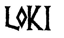
I believe I have come up with something I like:
Comment
-
I like that. A runic font is perfect considering the name's origin.
You mentioned using a gothic font in your first post and I had intended to respond to that but am easily distracted.... oh look! shiny... anyway, I've never seen a guitar with an Olde English logo that looked any good. They always look like someone got some rub-on stencils at the local newsagent. No matter the quality of the instrument, they look like a guitar assembled in some kid's bedroom out of MIC parts. Especially when the headstock is really raw maple.Hail yesterdayComment
-
That's cool, my 2 cents from that would be something like this :
 Enjoying a rum and coke, just didn't have any coke...
Comment
-
Yeah, I tried a few Gothic fonts, and although the fonts did look cool, they look a bit overdone as a logo, plus I think this one looks more Norse, and suits the name better. I generally use dark colored veneers or caps on my headstocks like ebony or wenge, so the logo will be just plain white, possibly with an offset outline. I've got to try a few things and see what looks best, and then I need to have some decals made up. I considered inlaying the logo, but it's an awful lot of work for something that really is almost superfluous. I've been pretty successful at inlaying MOP so far, but like I said, a whole logo is a ton of work.Originally posted by VitaminG View Post
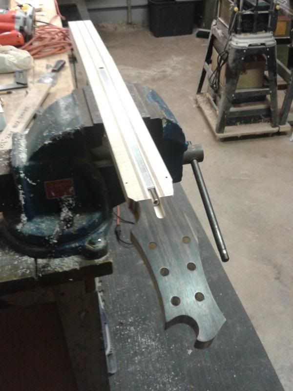
Here's a pic of the neck I'm working on at the moment. This one is an ebony cap.
Comment
-
-
But can it open beers?!?GTWGITS! - RacerXComment


Comment