Announcement

Collapse
No announcement yet.

Band Logos

Collapse
X
 
  • Filter
  • Time
  • Show
Clear All
new posts

  • Band Logos

    Where do people get the logos for their band? I'd guess a good deal of people would commision an artist or something like that? I've been messing with photoshop and trying to come up with a few ideas for my band, I got some nice ones but I'm not sure how usable they are.
    What are the usual file types that people save them in - JPEG or something more flexable?
    Also feel free to post your bands logos. I'd be happy to see what people go for with theirs.

  • #2
    Just figure out some style of letters you cannot read and go from there.Make sure the band name is something fearful like "Shaved Monkey Nuts" then make the logo so ornate you can't read it.Thats what everyone else does.
    Really? well screw Mark Twain.

    Comment


    • #3
      Umm
      When you take a shower in space, you have to press the water onto your body to clean yourself, and then you gotta vacuum it off. - Ace Frehley

      Comment


      • #4
        Damn where is Ron when you need him.
        Really? well screw Mark Twain.

        Comment


        • #5
          I think most people hand-draw their logos and then take them to a professional to make them, well, professional-looking. Also then they can be easily reproduced.
          Scott

          Comment


          • #6
            Originally posted by straycat View Post
            Damn where is Ron when you need him.
            To find a similar thread from 2 years ago?


            (I found it by searching the word "twigs" )
            "Quiet, numbskulls, I'm broadcasting!" -Moe Howard, "Micro-Phonies" (1945)

            Comment


            • #7
              We actually stumbled across Dark Crystal font and liked it.


              Matt

              Comment


              • #8
                Does anyone know what kind of file is standard to send to promoters for posters and stuff? I've made some before but the guys only sent me shitty versions that I had to work around and that ended up looking fairly weak on the poster.
                What I've been doing is taking a regular font I like the look of, then using photoshop and tweaking some of the letters, to give it more of a unique look to it.

                Comment


                • #9
                  Originally posted by Spivonious View Post
                  I think most people hand-draw their logos and then take them to a professional to make them, well, professional-looking. Also then they can be easily reproduced.
                  not necessarily. Some albums look like the band logo was transferred directly off the front of the bass player's high school exercise book.
                  Hail yesterday

                  Comment


                  • #10
                    Originally posted by demeyes View Post
                    Does anyone know what kind of file is standard to send to promoters for posters and stuff? I've made some before but the guys only sent me shitty versions that I had to work around and that ended up looking fairly weak on the poster.
                    What I've been doing is taking a regular font I like the look of, then using photoshop and tweaking some of the letters, to give it more of a unique look to it.
                    If you want the logo to be infinitely scalable, it needs to be converted into a vector format. The most common file format for this sort of thing seems to be .eps (encapsulated postscript). Virtually everyone working with print can read that file format and start using the content right away. Sometimes .ai (Adobe Illustrator) is also accepted, but I say stick to .eps and you'll be okay. Illustrator can import it, as does Corel Draw, Photoshop etc (although Photoshop rasterizes it in the process).

                    Edit: I suppose I should also mention that vectorizing something isn't as easy as pushing a button most of the time - especially if the logo is very complex. You may need someone with hands-on experience in vector graphics to do it for you, or take the time and learn to do it yourself.
                    Last edited by Sunbane; 08-06-2007, 08:55 AM.

                    Comment


                    • #11
                      What the hell did sunbane just say?
                      Really? well screw Mark Twain.

                      Comment


                      • #12
                        He said, and I'll paraphrase, if you want a logo that you can reprint in any size and have it stay clean you need a file format that is made for such. Basically an EPS file is a mathematical formula. You say 'print this line from point a to point b. You can then scale that line 50%, 1000% or -25% and it will still be a clean line.

                        A bitmap, such as Matt's banner can not be scaled well. If you blow up Matt's banner by 200% it will be very pixelated.

                        Clear as mud?
                        http://www.jacknapalm.com/

                        Comment


                        • #13
                          Originally posted by straycat View Post
                          What the hell did sunbane just say?
                          I'm not sure. I think it was English, but even that I'm not sure about
                          Hail yesterday

                          Comment


                          • #14
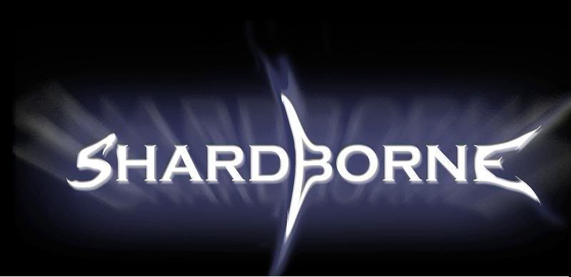
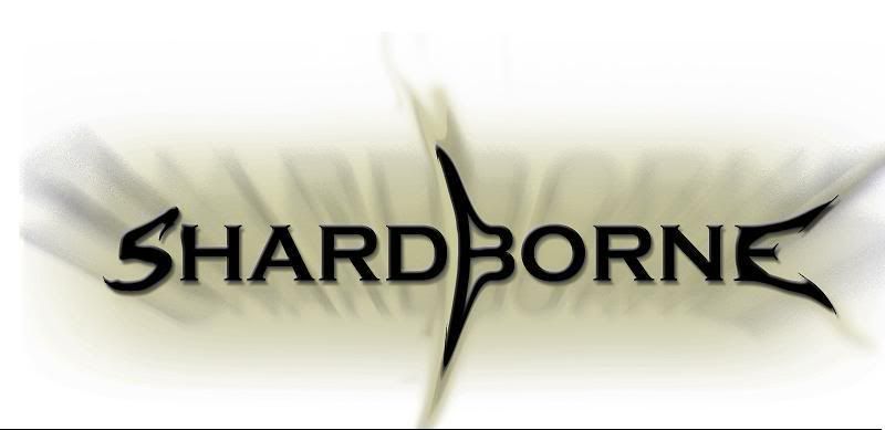
                            Here are 2 similar designs I came up with and the inverted version of one of them.


                            I'm going to see if I can come up with a simpler Black and white version that will be easier for people to use on posters. Not just a greyscale but a simple version without the effects on it.
                            I'll give it a go trying to use the EPS. I figured there might have been something and have headr people talk about the vector thing before but I didn't know what it was.
                            What do you guys think of the logo idea I made up? I've not shown all the band yet but I think it looks cool and is memorable enough.
                            More of you should show your bands logos too.

                            Comment


                            • #15
                              Originally posted by straycat View Post
                              What the hell did sunbane just say?
                              Learn the pen tool.

                              -Nate
                              Insert annoying equipment list here....

                              Comment

                              Working...
                              X